Architects: Powerhouse Company
Location: Netherlands
Partner in Charge: Nanne de Ru
Project Team: Nanne de Ru, Charles Bessard, Alexander Sverdlov, Nolly Vos, Wouter Hermanns, Anne Luetkenhues, Bjørn Andreassen, Joe Matthiessen
Project Team: Nanne de Ru, Charles Bessard, Anne Luetkenhues
Project year: 2005 - 2008
Structural Engineer: BREED ID, Gilbert van der Lee
Contractor: Valleibouw BV Veenendaal
Lighting: LS2 and BEDA electro
Photographs: Powerhouse Company
One
Villa 1 was the first villa commissioned to Powerhouse Company since its founding in May 2005. In order to mark the site a golden “1″ was nailed to a pine tree at the end of a dirt road.
Upside-down
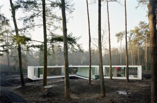
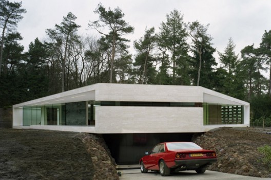
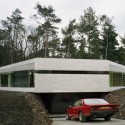
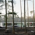
The forest, like most of the Dutch landscape, is manmade. Mostly Douglas Pines were planted there in the 1950s for the production of straight stems that could then be used as beams. The trees became mature enough to be harvested in the 1970s, paradoxically just when it became immoral to cut trees. The landscape thus turned from industrial to being natural. Now the site falls under the local “building-in-nature” regulations, which include a number of restrictions, among which height limitations for the gutter lines and volumetric restrictions for what could be build above ground. Since the spatial needs of the house called for at least twice the volume allowed by the regulations, we designed it upside-down: all day functions above ground and all bedrooms below, but with ample daylight access.
Why Y
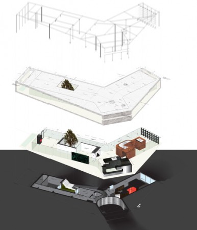
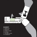
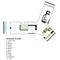
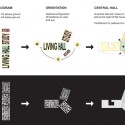
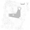
The site has a slight incline. It offers beautiful views on the forest and great sun exposure that we wanted to fully take advantage of. We thus came up with the distinctive Y-shape of the house: every wing is optimally oriented on the terrain and to the sun. There are three wings: one wing for work, studying and music making (North-West exposure); one for cooking and eating (East-South-West exposure); and one for living and painting (South and North exposure). In the basement, the Y-shape creates a similar functional clarity: one wing is for the master bedroom, one for cars and one for storage and guestrooms. A patio provides light for the guestrooms.
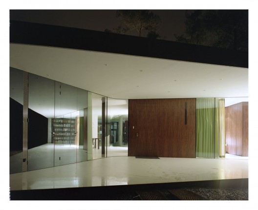
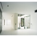
A singular frame envelopes the house, thus allowing for maximum transparency. The central area where all wings meet is the heart of the house. It is a large space that serves as entrance hall, dining room, bar and music-room. The Y plan stretches the house into the site and provides large panoramic views on the surrounding scenery. On the South and East sides, two large covered decks create sun shading in the summer and smooth the transition from outside to inside. In the basement the Y plan creates a clear division between the private quarters for the guests (with private entry through the patio), the garage and the master bedroom.
To each according to his needs
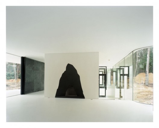
Every room on the ground floor can enjoy open views onto the landscape thanks to the wide transparent facade contained within the frame. Each wing is spatially organized in a sort of centrifugal manner. All mass is concentrated in a central core: a piece of furniture that contains all services and structural elements and that simultaneously creates different rooms within the entirely glazed space.
These large pieces of furniture allow for a free flowing distribution of functions without creating closed off rooms. It is thus possible to enjoy a pleasant stroll longer than 150 m through a variety of rooms immersed in the landscape.
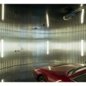
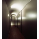
Counteracting the extreme openness of the ground floor, the basement level shelters the most intimate rooms of the house and takes on opposite spatial qualities, emphasized by the brutal and protective feeling of mass. Here, the scarcity of daylight is complemented by a richness in spatial effects. The rooms are carved out in the mass, creating vaulted ceilings and thick walls as a paradoxical result of the lightness of the vertical structure above ground. In the basement the heavy architecture retrieves the primordial qualities of Roman architecture.
Three
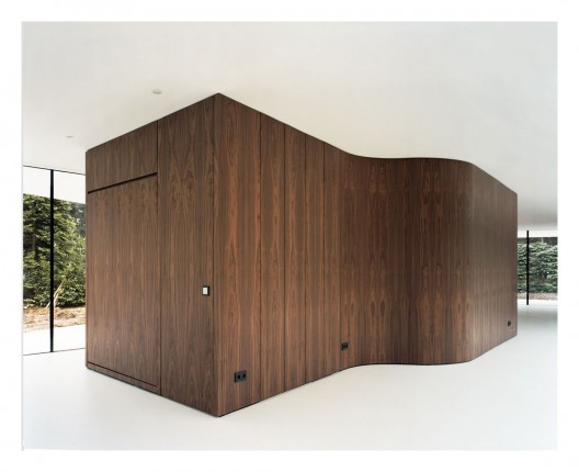
The three furniture pieces on the ground floor are distinctively different in their design, materials, feel and smell. We used wood to the North, slate to the East and concrete to the South.
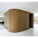
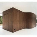
In the North wing an American nut-wood furniture piece ‘swallows’ a staircase, cupboards, a bed and a small bathroom. The curves of its outer shape create the entrance, a small and a large study and an acoustically sound piano-room.
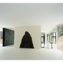
The kitchen is the second piece of furniture. It is entirely made of Norwegian slate and incorporates all kitchen appliances and storage, a toilet and a bar. It is as solid as a rock, yet gentle in its use - a sort of primordial sophistication.
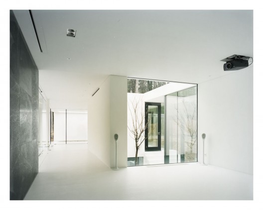
The third furniture piece consists of two concrete walls that incorporate a fire place, storage and video projector. This element opens up to create a patio bordered by a living room, garden room and atelier.
Miessian Gimp
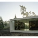
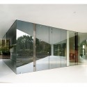
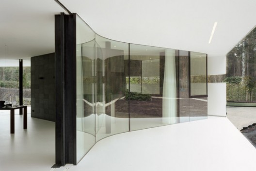
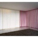
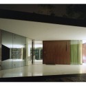
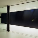
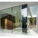
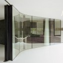
The glass facade is suspended between window frames hidden in the ceiling and floor. There is no vertical structure, only silicone joints to hold the glass. The only large opening is a huge green marble sliding wall (a sort of mobilized Mies wall) which opens the intimacy of the living room onto the terrace. Although made of marble, the sliding wall is very light as it is mounted on honeycomb aluminum plates (a Chinese invention called stone-veneer now produced in Texas, USA, with predominantly Middle East stones). The marble sliding wall wraps around a cross-shaped column clad with a black rubber skin: this is what we called the “Miessian Gimp”.
Technique
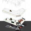
Structurally the house is a stack of different industrial building techniques. The basement is cast in concrete. The roof, with extreme cantilevers, is a complex steel structure designed by the audacious structural engineer Gilbert van der Lee. The bookshelf in the North wing is made entirely of solid steel plates and functions as a structural Vierendeel frame stabilizing the structure of the roof.
Root
As a result of its Y shape and architectural dichotomy, the villa provides a wide array of extreme spatial qualities, going from narrow, dark, vaulted corridors to wide-open, transparent garden rooms. The result is a landscape of different spatial perceptions that goes beyond the mere pragmatic diagram of functionality. This house is the result of an involuntary yet conscious choice to radically change a way of living. It is a house for the new life of a man and his new partner. A house that can provide him with a new place to live in, after losing his beloved one with whom he had lived thirty years in an old farmhouse bought in the seventies and which they had remodeled 8 times to fit their changing needs. This house had to be something radically new for him. It had to offer a new balance to a disturbed life. It had to provide a new anchor point. It is a house designed for a family to be re-rooted.
- basement plan
- ground floor plan
- exploted axo
- concept diagrams
- site plan


Keine Kommentare:
Kommentar veröffentlichen